

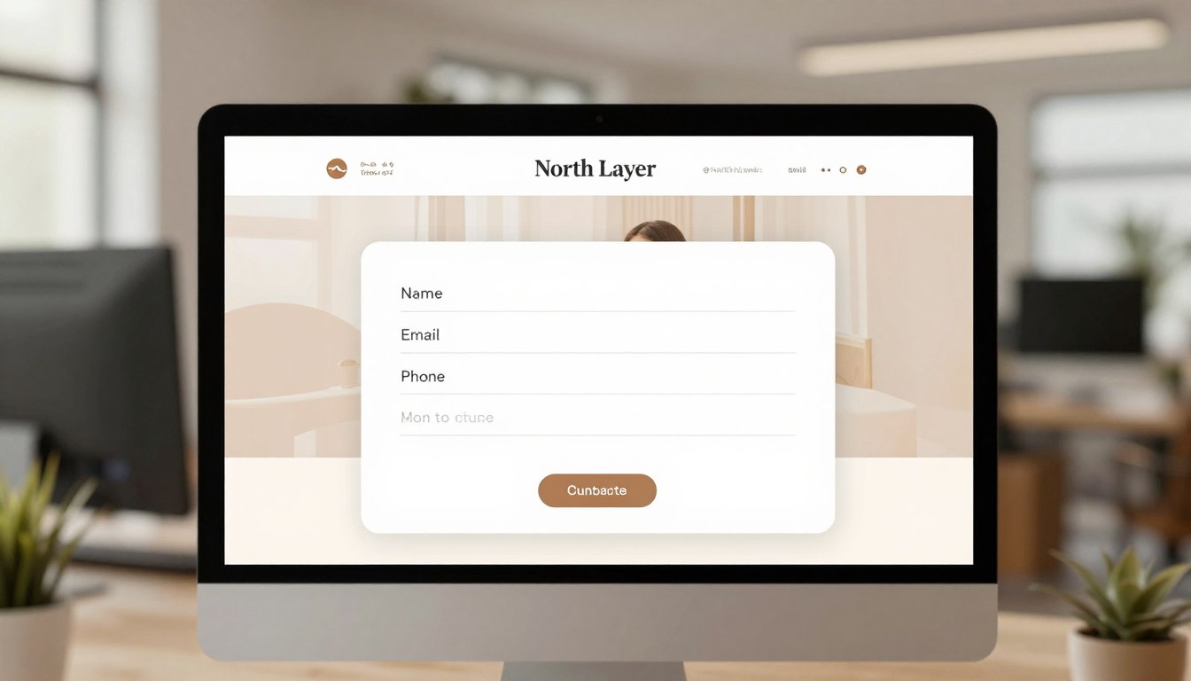
Every time someone visits your website, it’s a chance to turn them into a loyal customer. A good website contact form is key to this process. It’s not just a tool; it’s a way to build trust and start important conversations.
Making it easy for people to get in touch can open doors to new business. An effective online contact form makes sure people feel like they’re being heard. This way, you can turn casual visitors into real customers.
We think making things easier is the key to getting more people to take action. Whether you’re tweaking a contact form for website or a standard contact us form, the goal is the same. You want to make it easy for users to take the next step without feeling overwhelmed.
Key Takeaways
- Prioritize simplicity to increase user engagement and lead generation.
- Design layouts that reduce friction during the inquiry process.
- Build trust by ensuring your communication channels feel accessible.
- Focus on essential fields to improve completion rates significantly.
- Implement clear follow-up strategies to nurture new prospects effectively.
The Importance of a Website Contact Form
Every visitor to your site is a chance to connect. A website contact form makes it easy to grab that chance. It saves users from searching for email addresses or leaving your site.
Enhancing User Experience
A simple, easy-to-use website form makes starting a conversation easy. When users see a clear contact us form, they know their message will get through fast.
This way, you respect visitors’ time. A form lets them send messages without the hassle of copying email addresses.
Facilitating Communication
A professional web contact form does more than just collect messages. It organizes the data in a way that’s easy to handle. Unlike a simple email link, it gives you the exact info you need to help.
- Standardized data: You always get the right info.
- Faster support: Your team can quickly sort and tackle requests.
- Reduced spam: It helps block unwanted emails compared to public email addresses.
Driving Conversions
The main goal of a web contact form is to turn visitors into leads. When it’s easy for someone to ask a question, you’re more likely to make a sale.
A website contact form is like a silent salesperson that never stops working. It captures contact info right away, so you can follow up when interest is high. This can really boost your sales.
Using a dedicated contact us form means no messages get lost. This organized approach is key for any business wanting to grow its marketing efforts and build strong client relationships.
Key Elements of an Effective Contact Form
Creating a top-notch website contact form is all about finding the right balance. You want to get the info you need without making it too hard for users. Too many questions can scare people off. Aim for a form that’s easy to fill out and gets you the good leads you want.
Simple Fields vs. Complex Forms
Keep your forms short and sweet. Focus on the essential trio: name, email, and a message. This makes it easy for users to get in touch with you.
If you need more info, use smart logic to show extra fields only when needed. This way, users don’t feel overwhelmed by too many questions.
Clearly Defined Purpose
Your website contact page should have a clear goal. Whether it’s for sales leads or customer support, the right format is key. For most inquiries, an embedded form is best.
For more complex processes, a multi-step form can help. But for quick interest, popup forms are great, as long as they don’t disrupt the user. Make sure the form’s purpose is clear so users know what to expect after submitting.
Mobile-Friendliness
Most visitors come from mobile devices, so your form must be mobile-friendly. It should have big, easy-to-read fields and avoid tiny buttons or menus. A single-column layout works best on any device.
By making your form easy to use on mobile, you help users complete their requests fast and right. A smooth mobile experience can turn a visitor into a customer.
Best Practices for Form Design
Your website contact page is like a digital handshake. Its design sets the tone for the first impression. When it’s easy to use, visitors feel comfortable sharing their info. A well-designed contact form makes it simple for people to get in touch.
Choosing the Right Layout
A good layout is key to a smooth submission process. Grouping related fields together helps users understand the process quickly. For instance, put name and email in one spot, and messages in another.
A single-column layout works best. It guides the eye down, making it easy to follow. Consistent spacing keeps the page looking clean and professional, building trust.
Color and Typography Considerations
Clear visuals are vital for a great website contact page. Make sure text stands out against the background. Avoid light gray text on white, as it’s hard for many to read.
Choose a font that’s easy to read on phones without zooming. A sans-serif font keeps the design modern and friendly. When your design is easy to scan, users are more likely to fill out the form.
Using Visual Cues
Clear guidance is key in the submission process. Don’t rely on placeholder text that disappears when typing. Use permanent labels above each field to guide users.
To make your contact form for website better, consider these visual cues:
- Field Focus: Highlight the active field with a border color change so users know exactly where they are typing.
- Error Handling: Provide clear, immediate feedback if a field is filled out incorrectly.
- Keyboard Access: Ensure users can easily tab through fields without needing a mouse.
- Success Messages: Display a clear confirmation once the form is submitted to reassure the user.
These small details help visitors recover from mistakes quickly. By focusing on these design elements, you create a seamless experience that encourages more inquiries and better business outcomes.
Common Mistakes to Avoid
Creating a top-notch web contact form means avoiding common mistakes. These mistakes can stop people from contacting your business. Spotting these issues early helps keep your communication lines open and effective.
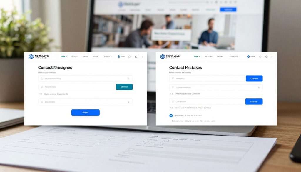
Overloading with Information
Asking for too much info at first is a big mistake. Too many fields on a website form can overwhelm users. Stick to the basics like name, email, and a short message.
Every extra field adds to the user’s mental load. If you need more info, ask for it later. This saves time and boosts your form completion rates.
Lack of Clear Call to Action
A vague button can confuse visitors. Use clear, direct language like “Send Message” or “Get My Quote” on your website contact page.
Also, always show a confirmation message after sending the form. This reassures users and prevents duplicate submissions. A simple “Thank you, we will be in touch soon” builds trust.
Ignoring Mobile Responsiveness
More people use smartphones to surf the web. If your website form doesn’t work on small screens, you’ll miss out on many visitors. Make sure fields are big enough to tap and the layout is clean on mobile.
Test your web contact form on various browsers and devices. Also, use basic spam protection like a hidden honeypot field. This keeps your inbox clean without annoying real visitors.
| Common Mistake | Negative Impact | Recommended Fix |
|---|---|---|
| Too many fields | High abandonment rate | Keep to 3-4 essential fields |
| Vague button text | User uncertainty | Use clear, action-oriented labels |
| Non-responsive design | Poor mobile experience | Use fluid, mobile-first layouts |
| No confirmation | Duplicate submissions | Display a success message |
Customizing Your Contact Form
A well-designed contact form for website visitors acts as a silent ambassador for your business. It connects a casual browser with a committed lead. Tailoring the look and feel of your inquiry process makes every interaction feel like a natural part of your brand.
Branding and Aesthetics
Your contact form design should match your site’s visual language. Use consistent colors, fonts, and spacing for a professional look. When a visitor goes from your homepage to the contact page, it should feel smooth and intentional.
Keep the layout simple to avoid overwhelming the user. Simplicity is your greatest asset for high completion rates. By removing distractions, visitors can focus on reaching out to your team.
Setting Up Automated Responses
After a user submits their info, the conversation shouldn’t end. An automated response is key for managing expectations and building rapport. A thoughtful confirmation message shows the visitor their inquiry was received.
Use this chance to explain the next steps clearly. Avoid promising specific response times your team can’t keep. Instead, give a realistic timeframe and thank them for their interest.
This automated follow-up is a strong tool for your online contact form strategy. It turns a static submission into an active communication loop. By providing clarity and confirmation, you show you value the visitor’s time and are ready to help.
Integrating Contact Forms with Other Tools
A good online contact form does more than just collect data. It connects your website to your business tools. This means no manual data entry and no missed messages.
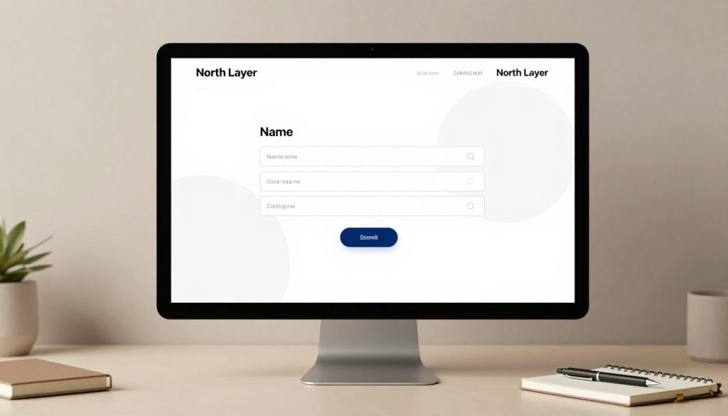
CRM Systems and Lead Management
Linking your forms to a CRM system turns messages into actionable business intelligence. Automated routing sends each message to the right person right away.
This way, your sales team can track every interaction from the start. It saves contact details automatically, cutting down on errors. This lets you focus on building relationships, not managing data.
Email Marketing Integration
Connecting your form to an email marketing platform helps nurture new leads. But, it’s key to keep service and promotional emails separate.
Make sure your form has a clear consent checkbox for marketing. This way, you can send useful follow-ups without spamming new leads. Proper integration respects users and keeps your strategy professional.
Testing and Optimizing Your Contact Form
Using data to make decisions is key to a top-performing contact form design. Instead of guessing, rely on facts to improve your site’s visitor interaction. This method ensures every change boosts your conversion rates.
A/B Testing Strategies
A/B testing lets you compare two website contact form versions to see which works better. You might test different button colors, field counts, or call-to-action wording. By changing one thing at a time, you find out what makes people click submit.
Think about how form length affects your results. Many businesses struggle with low completion rates because they ask too much. Shortening your form from seven fields to three can significantly increase qualified leads. It makes it easier for people to start.
Analyzing User Behavior
It’s just as important to understand how visitors move through your page as it is to design it. Look for where users stop. If many people quit at a certain field, it might be too hard or confusing.
Mobile users face different challenges than desktop users. Make sure your contact form design works well on smaller screens. If it’s hard to scroll or type on, you’re losing chances. Regular checks help you smooth out these issues for all visitors.
Gathering Feedback from Users
Improving your communication channels starts with listening to your users. When you make it easy for visitors to share their thoughts, you get valuable insights into your site’s performance. A well-designed contact us form is just the start of a strong relationship with your audience.
Surveys and Follow-Up Emails
You don’t need to overwhelm visitors with long surveys. Keep your initial contact us form brief to get more responses. Then, you can ask for more details in a polite follow-up email.
Here are some tips for gathering feedback effectively:
- Send a short, automated email after a request is resolved to ask about the ease of the process.
- Use a single-question survey on your “Thank You” page to gauge immediate sentiment.
- Keep questions focused on clarity and the quality of the interaction, not personal data.
Measuring Satisfaction
Tracking user interactions helps you spot common issues. By monitoring specific metrics, you can make your business more responsive and helpful. Focus on these key performance indicators to improve your results:
- Time to first reply: Speed is often the most critical factor in user satisfaction.
- Response quality: Ensure your team provides clear, actionable answers to every inquiry.
- Completion feedback: Look for patterns where users might abandon the contact us form mid-way.
By regularly reviewing these metrics, you show you value your customers’ time. This approach turns a simple inquiry into a positive brand experience that fosters long-term loyalty.
Legal Considerations for Contact Forms
When someone fills out a website form, they share personal info with you. This comes with legal duties. It’s not just about following rules; it’s about keeping your reputation strong. Only collect data you really need to cut down on risks.
Understanding GDPR and CCPA
The General Data Protection Regulation (GDPR) in the EU and the California Consumer Privacy Act (CCPA) in the U.S. have strict rules. They say you must be transparent about how you handle the data from your website form.
Make sure people give clear consent before you use their data. For EU visitors, this means using opt-in boxes that aren’t ticked by default. In the U.S., while rules differ, it’s wise to give clear data use notices to everyone.
Privacy Policy Transparency
Your privacy policy should be easy to find, right below your website form. It should explain how long you keep data and how users can get access to or delete it. Responsible handling of data is key, not just when you first get it.
Check your data regularly to stay in line with laws and avoid trouble. By being open and straightforward, you show you respect your customers’ online rights.
| Requirement | GDPR (EU) | CCPA (US/California) |
|---|---|---|
| Consent Basis | Explicit Opt-in | Notice at Collection |
| Data Access | Right to Portability | Right to Know |
| Form Transparency | Mandatory Privacy Link | Mandatory Privacy Link |
| Data Minimization | Strictly Required | Recommended Practice |
A well-run website form connects you with your customers. By focusing on legal openness, you build trust. This trust is the base for growth and secure lead management.
Future Trends in Website Contact Forms
Modern digital interactions are changing fast to meet user needs for quick and easy interactions. Soon, contact form design will focus on smarter, more intuitive ways for customers to get in touch with your business.
AI and Chatbot Integrations
Artificial intelligence is making forms smarter. Tools like Intercom or Drift can guide visitors through specific inquiry paths. This technology helps sort messages before they reach your inbox, saving time for everyone.
Voice-Activated Contact Forms
Voice technology is the next big thing for accessibility. Soon, users might just speak their questions into a form field. This change needs careful attention to privacy and clear steps to confirm accuracy.
We think these advancements should make things easier, not harder. Your main goal is to make it easy for visitors to convert. Focus on clean, easy-to-use layouts that respect users’ time. Try out these new features to see if they really help. A thoughtful approach to contact form design keeps your business ahead while keeping a personal touch with every lead.