


Many small business owners raise marketing budgets to bring more visitors. They buy social media ads or search campaigns, hoping revenue will grow quickly. But sending potential customers to a site that performs poorly is a costly mistake.
If your digital storefront is not a mobile-friendly website, you may lose sales before they begin. Customers expect a smooth experience on their phones. Pages that take too long to load make visitors leave.
Prioritizing mobile optimization helps each advertising dollar produce a lead or sale. A fast loading speed supports a strong digital strategy. Before increasing marketing, fix these technical barriers to protect profits and improve return on investment.
Key Takeaways
- Marketing spend is wasted if your site cannot handle mobile traffic effectively.
- A poor user experience on phones leads to immediate bounce rates and lost revenue.
- Technical performance, such as load times, directly impacts your conversion rates.
- Fixing your digital foundation is more cost-effective than buying more traffic.
- Prioritize site usability to ensure your advertising budget works as hard as you do.
Understanding the Importance of Mobile-Friendly Websites
Your website often gives potential customers their first impression. Today, that impression usually happens on a smartphone. Before clients call or visit, they may scan your site to judge its credibility.
A mobile-friendly website is no longer a luxury. It is the main gateway to business growth in a digital-first economy. Easy small-screen navigation builds immediate trust with your audience.
Why Mobile Optimization Matters
Effective mobile optimization does more than shrink your desktop site for a phone. It creates a seamless user experience, helping local customers find your hours, services, and contact information in seconds.
“Design is not just what it looks like and feels like. Design is how it works.” — Steve Jobs
When customers search for local solutions, they compare your site with competitors. Slow pages or constant zooming can drive them toward businesses with smoother, more professional interactions.
The Stats Behind Mobile Usage
Mobile-first browsing has changed how small businesses must operate. The following table shows why prioritizing your mobile presence is a critical business decision.
| Device Type | Average Usage | Conversion Potential |
|---|---|---|
| Mobile Devices | 60% of Traffic | High for Local Intent |
| Desktop Computers | 35% of Traffic | High for Research |
| Tablets | 5% of Traffic | Moderate |
Consequences of Poor Mobile Experience
Ignoring a mobile-friendly website puts your bottom line at risk. A poor user experience often causes high bounce rates. Visitors may leave almost immediately after arriving.
This lost traffic means more than a design problem; it creates a missed revenue opportunity. When your site fails to perform, potential clients may see your business as outdated or unreliable. Investing in mobile optimization prevents wasted marketing spending on traffic that cannot convert.
Key Elements of a Mobile-Friendly Website
A good digital store works well on any device. When your site works great on phones, more people can see what you offer. A mobile-friendly website is now a must for growing your business.
Responsive Design Overview
Responsive design is key for mobile success. It makes your site adjust to the screen size of the visitor. This way, users don’t have to zoom or scroll too much.
Fluid grids and flexible images keep your site looking good on all devices. This SEO-friendly layout helps search engines find and index your pages. It’s important for staying visible in local searches.
Page Speed and Performance
Mobile users don’t like to wait. A fast loading speed is essential. If your site takes too long to load, many visitors will leave.
Optimize your images and cut down on heavy code to speed up your site. A quick load time shows users that your business is trustworthy and reliable.
Navigation and User Interface
Your mobile site should be simple and easy to use. With less space, your menu needs to be clear and easy to navigate. Mobile compatibility means using big buttons and enough space between links.
The table below shows the main differences between desktop and mobile design:
| Feature | Desktop Priority | Mobile Priority |
|---|---|---|
| Navigation | Horizontal Menu Bar | Collapsible “Hamburger” Menu |
| Interaction | Hover Effects | Tap and Swipe Gestures |
| Content | Multi-column Layouts | Single-column Vertical Flow |
| Buttons | Small, Precise Clicks | Large, Thumb-friendly Targets |
Common Mobile Usability Issues
Poor mobile usability can stop people from buying before they even get to your checkout. If your site is hard to use on a phone, visitors won’t stick around. They’ll go to a competitor’s site instead.
Text Size and Readability
Big text that needs zooming is a big no-no. It makes your site hard to read on phones. Use a font size that’s easy to see without zooming.
“Design is not just what it looks like and feels like. Design is how it works.”
Improperly Sized Images
Big images slow down your site on phones. This makes visitors leave quickly. It’s a big problem for your site’s speed.
Images that don’t fit right can mess up your site’s look. This makes users scroll sideways, which is annoying. Make sure your images fit well on all devices.
Clickable Elements Too Close Together
Ever clicked the wrong thing on your phone? This happens when things are too close together. It’s a big problem for your site’s feel.
To solve this, make some changes to your mobile-friendly website:
- Put more space around buttons and links.
- Make sure there’s enough room between interactive parts.
- Check your site on real phones to make sure everything is easy to tap.
Essential Features for Mobile Users
When people visit your site on their phones, they want to find what they need quickly. A mobile-friendly website means making it easy for them. Focus on key features to boost your mobile conversion optimization and make every tap count.
Simplified Forms
Long forms can be a big turn-off on mobile. Typing on a small screen is hard and often leads to people leaving. Keep your forms short by only asking for the most important info.
Use smart fields that know what keyboard to show, like a numeric pad for phone numbers. This makes it easier for visitors and reduces their effort.
Mobile-Friendly Call-to-Action Buttons
Your call-to-action (CTA) buttons need to be easy to spot and tap. A small or hard-to-reach button can cause accidental clicks. Make sure your buttons are big enough and have enough space around them.
“Simplicity is the ultimate sophistication in design, when space is limited by the size of a handheld device.”
Social Media Integration
Social media icons show your brand’s reach. But they shouldn’t get in the way of your main goals. Put them in the footer or a special section to keep things clean.
Adding these links right lets users check your business reputation without leaving your site. This balance keeps your site professional and encourages more interaction.
| Feature | Desktop Approach | Mobile Strategy |
|---|---|---|
| Form Fields | Detailed data collection | Minimalist, essential fields |
| CTA Buttons | Hover effects, text-heavy | Large, high-contrast tap targets |
| Navigation | Horizontal menu bars | Collapsible “hamburger” menus |
| Social Links | Prominent sidebar icons | Footer-based, subtle placement |
Best Practices for Mobile SEO
Mobile-first indexing means your site’s smartphone performance is key for search rankings. Search engines check your mobile site to see how your pages should show up in results. By focusing on mobile optimization, you keep your business seen by more phone users.
Optimizing Content for Mobile Searches
Mobile users want quick answers. An SEO-friendly layout helps search engines find your most important info. This is key for showing up in AI search summaries. Keep your text short and use clear headings.
Here are ways to make your mobile content better:
- Use bullet points to make text easier to read.
- Put your most important info at the top.
- Make sure your font is big enough without needing to zoom.
Importance of Local SEO
Customers searching for services nearby want fast, accurate results. Investing in local mobile SEO gets your business in map packs and local searches. Start by keeping your Google Business Profile up to date.
Being consistent online is key for local visibility. Make sure your business info is the same everywhere. Happy customers leaving reviews helps your local search ranking a lot.
Using Structured Data
Search engines use structured data to understand your website better. Adding this technical markup helps them know about your business hours, location, and services. This can lead to more clicks on your site.
Having an SEO-friendly layout and proper structured data is a solid base for your online presence. When you focus on local mobile SEO, it’s easier for nearby customers to find and choose your business.
Testing Your Mobile-Friendly Website
Before you spend more on ads, check if your site works well on phones. Assumptions about your site’s look on smartphones can waste your marketing budget and sales. Testing your site ensures a smooth journey for all visitors.

Tools to Assess Mobile Compatibility
The Google Mobile-Friendly Test is a great starting point. It quickly checks your page and shows issues on small screens. It’s free and a must for any business owner.
Manual checks on different phones and tablets are also key. This lets you see how your mobile-friendly website works in real life. Testing on various browsers and speeds is also important for mobile compatibility.
Metrics to Consider
Look at data that affects the user experience. High bounce rates on mobile often mean slow or hard-to-use sites. Also, check your mobile conversion rate to see if users meet your goals.
The table below shows important metrics to watch during testing:
| Metric | Goal | Impact |
|---|---|---|
| Page Load Time | Under 3 seconds | Reduces abandonment |
| Bounce Rate | Below 40% | Improves engagement |
| Conversion Rate | Consistent with desktop | Increases revenue |
User Feedback and Testing
Numbers are just part of the story. Ask real customers to use your site on their phones. This can show issues that automated tools miss. This feedback is key for improving your user experience and building trust.
Get your team or loyal clients to report any issues. Use the Google Mobile-Friendly Test and human feedback to make your site better. This thorough testing keeps your mobile-friendly website a strong tool for your business.
Making Design Choices for Mobile
Creating a great mobile experience starts with careful design choices. When people visit your site, they quickly judge your business based on how it looks on their screens. Making thoughtful mobile design choices helps your brand look professional and trustworthy to everyone.
Your website should be like a reliable digital store. By focusing on clear and easy-to-use design, you can turn visitors into loyal customers. These choices greatly affect your user experience and how long people stay on your site.
Choosing the Right Typography
Readability is key for a successful mobile site. Text that’s too small or spaced poorly makes users zoom in, leading to frustration. We suggest using a base font size of at least 16 pixels to keep your message clear without extra effort.
Consistency is key when picking fonts. Use no more than two fonts to keep your site clean and professional. Good, easy-to-read typography ensures your brand looks consistent on all devices.
Color Schemes and Contrast
Strong color contrast is vital for accessibility and visual hierarchy. If text and background colors are too similar, reading becomes hard, even in bright light. High-contrast colors make your call-to-action buttons and key info stand out.
Your color scheme should also reflect your brand. A balanced scheme creates harmony and guides users through your site. Remember, responsive design uses these visual cues to help users navigate easily.
Image Formats and Sizes
Large, unoptimized images slow down mobile sites. Always compress your images before uploading. Using formats like WebP can reduce file size without losing quality.
Properly cropping images is as important as their size. Make sure your images fit vertical screens well, avoiding unnecessary space or distortion. Effective media management makes your site faster and more enjoyable for your audience.
Content Strategy for Mobile Users
Mobile users have limited time and screen space, so every detail should offer value. A strong mobile content strategy uses clarity and speed to deliver your message without friction. Better presentation helps users stay longer and take action.
Shorter Paragraphs and Sentences
Narrow mobile screens make long text blocks hard to read. For an SEO-friendly layout, use short paragraphs with no more than three sentences. This structure lets users scan quickly and find what they need.
Simple language makes your content easier for a wider audience to read. Concise sentences lower the mental effort required from visitors. This direct communication style keeps users engaged on a mobile-friendly website.
Prioritizing Key Information
Place your most important details at the top of the page. Customers often seek specific answers, so make essential information easy to find. Consider placing these items in prominent positions:
- Clear service descriptions and pricing guidance.
- Easy-to-find location details and service areas.
- Direct contact options like “Click-to-Call” buttons.
Leading with these facts shows that you value the user’s time. This strategy supports effective mobile optimization because it can help visitors become leads faster.
Visual Content and Engagement
Visuals break up text and keep users interested. High-quality images or icons can explain complex services faster than words alone. Compress these assets to keep your mobile-friendly website fast.
You can also build trust with helpful resources such as:
- Frequently Asked Questions (FAQs) to address common concerns.
- Short, informative guides that solve specific customer problems.
- Trust signals like client testimonials or industry certifications.
Thoughtful resource placement supports your SEO-friendly layout and provides real value. Clear text and helpful visuals create a smooth journey from casual mobile visitors to loyal customers.
The Role of Page Speed in User Experience
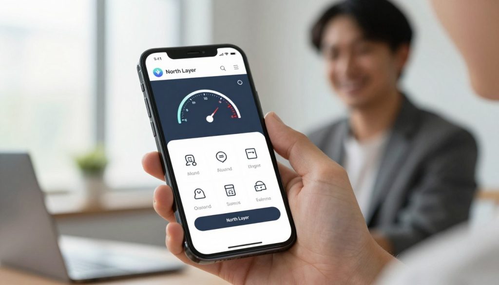
Every second matters when someone visits your mobile site. Speed is key in keeping them interested. If a page loads slowly, visitors often leave without seeing what you offer. This can hurt your business and user experience.
Understanding Load Times
Load time is how long it takes for a webpage to show up. For mobile users, this time is very short. They often use cellular data instead of Wi-Fi. A fast loading speed keeps visitors engaged and less likely to leave.
Fast sites are seen as reliable by search engines. This can lead to better rankings and more visitors. Boosting your mobile page speed is a smart move for your business.
Compression Techniques
Big files slow down your site. Compression makes images and scripts smaller without losing quality. New formats like WebP and Gzip help your site load faster on mobiles.
Caching stores parts of your site on the user’s device. This makes it quicker for them to come back. These tweaks improve user experience and encourage visitors to explore more.
The Impact of Mobile Hosting
Your hosting provider affects your site’s speed. A good host keeps your site stable even when it’s busy. Slow servers, no matter how optimized your site is, won’t meet fast loading speed demands.
Choose a hosting plan that focuses on performance and supports mobile traffic well. A solid infrastructure is key for better mobile page speed. Here’s how load times affect visitors:
| Load Time | User Perception | Conversion Probability |
|---|---|---|
| 1-2 Seconds | Excellent | High |
| 3-5 Seconds | Average | Moderate |
| 6+ Seconds | Poor | Very Low |
Tracking and Analyzing Mobile Traffic
It’s key to know how visitors use your site on mobile devices. This ensures your marketing budget is used wisely. Without mobile traffic analytics, you might miss out on opportunities and waste resources.
Tools for Analytics
Many strong platforms help you track your site’s performance easily. Google Analytics 4 is a top choice for tracking user journeys across devices. It shows where visitors come from and what they do on your site.
Google Search Console is also vital for small business owners. It points out mobile usability issues that could affect your search rankings. Using these tools together gives you a full view of your digital health.
Key Performance Indicators to Watch
While total visits are interesting, they don’t tell the whole story. Focus on metrics that show real business value, like your mobile conversion rate. This rate shows how many mobile visitors complete actions, like filling out forms.
Keep an eye on bounce rates and average session duration on mobile. High bounce rates or short sessions often mean your mobile site isn’t meeting user expectations. Tracking these behaviors helps you know which pages need work.
Adjusting Strategy Based on Data
Acting on data is key to improving your marketing ROI. If you see a high drop-off rate on a page, try simpler forms or clearer calls to action. Small, consistent adjustments based on real user behavior often lead to the best results.
Reviewing your data monthly helps you adjust your strategy before spending more on campaigns that don’t work. This proactive approach makes sure every dollar you invest works harder for your business. Use the table below to track your progress and find areas for improvement.
| Metric | What It Measures | Goal |
|---|---|---|
| Mobile Conversion Rate | Percentage of mobile users who take action | Increase by 5% quarterly |
| Mobile Bounce Rate | Users leaving after one page | Keep below 40% |
| Average Session Duration | Time spent on site | Increase engagement time |
| Form Completion Rate | Successful lead submissions | Optimize for mobile ease |
Integrating Marketing Strategies with Mobile Optimization
Driving traffic to a site not ready for mobile users is like inviting guests to a house with no front door. Before boosting your marketing spend, make sure your digital foundation is solid. A mobile-friendly website is key, ensuring a smooth experience for all visitors, no matter their device.
Aligning Social Media Campaigns
Social media platforms are often the first point of contact for customers. Sharing a link promises a specific experience. If that link leads to a hard-to-navigate page on a phone, you lose that lead instantly.
Consistency builds trust. Your social media posts, landing pages, and calls to action should match in language and style. This cohesive approach makes users feel comfortable moving from social feeds to your site.
Cross-Channel Marketing Techniques
Effective cross-channel marketing means all your efforts—email, search, social—aim for the same goal. When a customer clicks an email link, they expect the same quality as your social media ads. Proper mobile optimization ensures smooth transitions across all platforms.
“The user experience is the silent ambassador of your brand. If your site fails on mobile, your marketing message fails with it.”
Small businesses should regularly audit their customer journey. Testing how different channels interact with your mobile site helps find friction points. This proactive approach saves your budget by avoiding wasted traffic.
Mobile Advertising Trends
Modern mobile advertising focuses on intent and speed. Users expect fast load times and clear, actionable buttons. If your ads promise quick solutions, your landing page must deliver without delay.
| Marketing Channel | Mobile Focus | Primary Goal |
|---|---|---|
| Social Media | Visual Engagement | Brand Awareness |
| Email Marketing | Personalized Offers | Customer Retention |
| Search Ads | Immediate Solutions | Direct Conversion |
Investing in mobile optimization before scaling your paid campaigns is wise. It reduces the risk of paying for visitors who bounce due to poor site performance. By aligning your strategy, your website becomes a high-performing asset for long-term growth.
Future Trends in Mobile Web Design
The digital world is always changing with new tech. This means we need to stay ahead by focusing on the basics. Building a fast, accessible site is key, not just following every trend.
The Rise of Progressive Web Apps
Progressive web apps are a mix of websites and mobile apps. They offer a quick, reliable experience that works offline. This technology boosts engagement without needing users to download apps.
Voice Search Optimization
More people use smart speakers to find local services. To optimize for voice search, use clear, conversational content. Make sure your site’s data is structured for search engines to understand your business.
Focus on a clean, mobile-friendly design that meets your customers’ needs today. Innovations like AI will favor sites that are already fast and easy to use. Invest in these core areas to make your marketing budget work for you.