

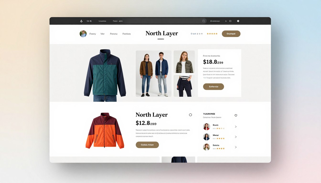
Many small business owners face a big challenge: keeping visitors on their site. Shoppers make up their minds quickly if they want to stay or leave. A well-designed ecommerce product page is like a digital storefront. It answers important questions before a customer decides to leave.
We think small changes can make a big difference. By focusing on clarity and trust, you can turn casual browsers into loyal buyers. You don’t need to change your whole site to do this.
This guide will show you how great product images and clear call-to-action buttons can help. We’ll also talk about how SEO-friendly content and clear prices help your conversion optimization goals. These steps help you make the most of every visitor to your site.
Key Takeaways
- First impressions happen in seconds; ensure your layout answers buyer questions immediately.
- High-quality visuals are essential for building trust and reducing purchase anxiety.
- Strategic placement of buttons guides users toward the checkout process effortlessly.
- Transparent pricing and clear information prevent unnecessary cart abandonment.
- Small, iterative improvements often yield better results than a total site redesign.
Importance of Product Page Design for Ecommerce Success
Your product page is like a digital store where people become loyal customers. It’s the last step before a sale is made. By focusing on ecommerce product page design, you make it easy for people to buy with confidence.
Building Trust with Customers
Trust is key online. Today’s shoppers look for signs of trust before buying. A clean, professional design shows your business is reliable and values the user experience.
To build trust, focus on these areas:
- Clear, honest product descriptions.
- Real customer reviews and ratings.
- Transparent shipping and return policies.
- Easy-to-find contact information.
The Role of Visual Appeal
Visuals grab attention first. Good images let customers see details, textures, and colors up close. But, visuals should never compromise functionality.
Good best practices mean your design should focus on the product. Avoid too many pop-ups or animations. Instead, use a layout that keeps the focus on what you’re selling.
Impact on Conversion Rates
Your page’s layout affects your sales. If information is hard to find or checkout is slow, people leave. That’s why conversion optimization is key to growth.
By making navigation simple and removing barriers, you lower bounce rates. A well-organized page leads users to the call-to-action button. When your design follows user experience principles, it’s easier for customers to buy.
“Design is not just what it looks like and feels like. Design is how it works.”
Investing in conversion optimization leads to more sales and happy customers. By following best practices, your store stays competitive in a crowded market.
Key Elements of an Effective Product Page
Creating a great ecommerce product page design means using key elements to guide users to buy. By following best practices, your site will feel professional and trustworthy. This makes it easy for visitors to find what they need without getting lost.
High-Quality Product Images
When shoppers first see your site, they notice the visuals. Your product images should be high-quality and show the product from different angles. This helps customers imagine the item in their own space.
Showing the product in use is also helpful. It lets buyers see its size and how it works. Clear, high-resolution photos make customers feel more confident in their purchase. When they can see the details, they’re more likely to buy.
Detailed Product Descriptions
Your descriptions should highlight the benefits of the product, not just its features. Use short paragraphs and bullet points to make it easy to read. This keeps your content SEO-friendly and engaging for users.
Make sure your site is mobile-friendly, as many people shop on their phones. Use clear, easy-to-read text on smaller screens. This helps customers understand why your product is right for them.
| Element | Effective Approach | Common Pitfall |
|---|---|---|
| Call-to-action buttons | High contrast and clear placement | Hidden or vague labels |
| Loading speed | Optimized images for fast performance | Large, uncompressed files |
| Product layout | Scannable, bulleted benefits | Long, dense paragraphs |
| Visuals | Multiple angles and context | Single, low-quality photo |
Place your call-to-action buttons near the price and availability info. This keeps the site fast and focused. When you put these elements together, you create a smooth experience that turns visitors into loyal customers.
Mobile Optimization for Ecommerce Pages
Mobile shopping is now the main way people interact with your brand. When someone visits your site on a smartphone, they want an easy experience like on a desktop. Making your store mobile-friendly keeps you ahead in the digital market.
Importance of Responsive Design
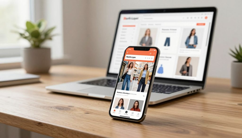
A responsive ecommerce product page design changes its layout for any screen size. This means no need for zooming or pinching, which can annoy buyers. Your content stays easy to read and looks good on all devices thanks to fluid grids and flexible images.
- Text scales appropriately for comfortable reading.
- Images resize without losing clarity or detail.
- Layouts stack vertically to maintain a logical flow.
User Experience on Mobile Devices
For a great user experience on mobile, it’s not just about a smaller desktop site. You need to design for the “thumb zone,” making sure buttons and links are easy to tap. Simple navigation helps shoppers find what they need fast and feel confident in their purchases.
Here are key elements for a better mobile experience:
- Large, high-contrast call-to-action buttons.
- Simplified menus that do not clutter the screen.
- Sticky “Add to Cart” buttons that remain visible while scrolling.
Page Load Speed
Slow loading speed can quickly lose a customer. If a page takes too long to load, shoppers might leave and go to a competitor. A fast site keeps users engaged and shows search engines your store is reliable.
Regular technical checks are key to keeping your site fast. Tools like Lighthouse testing help find what slows your site. Watching your Core Web Vitals ensures your user experience stays smooth and efficient for all visitors.
The Psychology of Color in Ecommerce
Your choice of color palette greatly affects how visitors see your brand and products. Color isn’t a magic button for sales, but it guides the user experience. By using color wisely, you can draw attention to key parts of your page.
Choosing the Right Color Palette
A good design needs a color palette that shows your brand and is easy to read. Aim for a high-contrast look where text is clear against the background. This makes your message easy for everyone to see.
When picking your main and secondary colors, follow these best practices for a professional look:
- Neutral backgrounds: Use white or light gray to focus on your products.
- Brand accents: Save your brand colors for headers, buttons, or key highlights.
- Consistent spacing: Use color to define sections, making the page easy to scan.
“Color is a power which directly influences the soul. It is the keyboard, the eyes are the hammers, the soul is the piano with many strings.”
Colors That Drive Action
To boost conversion optimization, create a clear visual order. Buttons for buying should stand out. If everything is bright, nothing will grab the user’s eye.
Test your color choices against real visitor behavior, not just your own taste. Small changes in button color can make a big difference in how users shop.
| Color Element | Strategic Purpose | Impact on User |
|---|---|---|
| Primary Action | High Contrast | Increases Click-Through |
| Secondary Links | Subtle Tone | Reduces Distraction |
| Background | Neutral Shade | Improves Readability |
By following these best practices, you create a site that feels thoughtful and trustworthy. Focus on clarity and visual priority for a better user experience and long-term conversion optimization goals.
Using Customer Reviews Effectively
Customer reviews connect your product claims with the real user experience. Instead of just placing them at the bottom of your site, use them where they’re most helpful. This builds trust and clarity, following best practices.
Placement of Reviews on the Page
Putting reviews in the right place helps shoppers find answers without leaving the page. For example, fit feedback next to sizing charts is super helpful. It lets customers see how clothes fit on real people before buying.
Also, put durability comments near product specs. This links social proof with product details, making it easier to buy. It turns static text into a useful guide for visitors.
Encouraging User-Generated Content
Being real is key in ecommerce today. Ask customers to share photos of their buys. Visuals often mean more than words. Make sure to label these as verified purchases to show they’re from actual users.
Ask customers to rate things like quality and value. This helps future buyers make quick, informed choices. Here’s how different types of feedback help your store succeed.
| Review Type | Primary Benefit | Impact on Sales |
|---|---|---|
| Verified Purchase Labels | Builds immediate trust | High |
| Customer Photos | Provides visual proof | Very High |
| Attribute Ratings | Clarifies specific doubts | Medium |
| Detailed Text Feedback | Adds depth and context | Medium |
The Role of Pricing and Discounts
How you show costs and savings can make or break a sale. Hidden fees or confusing prices can make shoppers leave quickly. Giving clear financial information builds trust and encourages purchases.
Good conversion optimization means making buying easy. Show all costs before customers click call-to-action buttons. This makes shopping feel honest and professional.
Displaying Prices Clearly
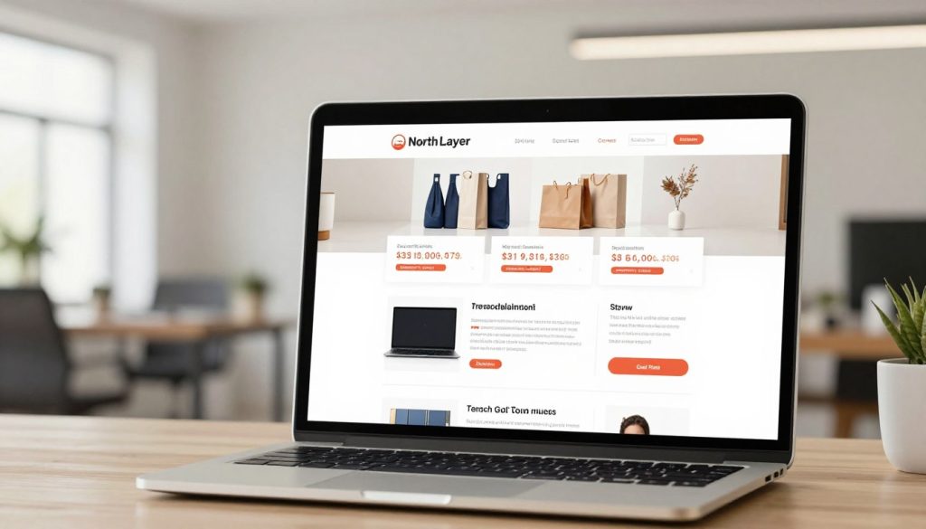
Being open is key to easing buyer worries. Show the base price clearly, but don’t stop there. Add shipping costs, return policies, and stock status to give a full view of the deal.
A mobile-friendly design is essential for showing prices. Make sure prices are easy to see on smaller screens. When customers see the total cost right away, they’re more likely to buy.
Strategies for Offer Discounts
Discounts should feel like a treat, not a trick. Simple, clear offers work best for small businesses. Try threshold-based free shipping to encourage adding more items.
Bundling items can also boost sales. Grouping related items at a discount adds value and simplifies choices. Make sure limited-time promotions are clear to create urgency without stress.
Keep discount rules simple. If a coupon is needed, place the field near your call-to-action buttons. A clean, mobile-friendly design helps turn visitors into buyers.
Enhancing User Experience with Navigation
Intuitive navigation is like a digital guide, helping shoppers find what they need quickly. When a site is easy to navigate, it greatly improves the user experience. This makes visitors stay longer and less likely to leave without buying.
Clear Menu Structure
Many stores organize menus by internal departments. But, we suggest organizing menus based on what customers say and do. This way, your site matches how people think about your products.
To get this right, try card sorting with 15 to 20 customers. It shows how they organize items, helping you create labels that make sense. Following these best practices makes your menu feel natural and useful from the start.
Breadcrumbs and Filters
Shoppers can get lost in big product catalogs. Breadcrumbs act as a map, showing where they are and how to go back. This feature stops the hassle of always going back.
Filters are also key for a good user experience. They let customers filter by size, color, or price, making choices faster. By using these best practices, you help visitors find what they need quickly.
The Impact of Product Videos
Adding movement to your product pages can change how customers see your items. While product images are key, they might not answer all questions. Video content adds a dynamic layer of info, helping bridge the gap between looking and buying.
Benefits of Incorporating Videos
Videos let you show how a product works in real life. For example, a short video can show a fabric’s texture or how a gadget is assembled. This clarity can stop shoppers from leaving without buying.
Retailers like ASOS use videos with product images and fit assistants. They show how clothes move on a model, helping customers see the fit better. This approach lowers return rates and builds trust in the brand.
Best Practices for Video Content
Your video content must be mobile-friendly and fast. Big files can slow down your site, which annoys users and hurts your rankings. Always compress files and make sure they have clear controls.
Here are some formats to keep viewers interested:
- Product demonstrations: Show the item in action to highlight key features.
- Unboxing clips: Build excitement and show exactly what arrives in the package.
- Lifestyle scenes: Place the product in a real-world setting to show scale and utility.
The table below shows how different media types improve the shopping experience:
| Media Type | Primary Benefit | User Impact |
|---|---|---|
| Static Photos | Visual detail | High clarity |
| Product Videos | Context and motion | Reduced uncertainty |
| Fit Guides | Size accuracy | Lower return rates |
By making your video assets mobile-friendly, you ensure a smooth experience for all. Focus on short, impactful clips that add value without getting in the way of the info shoppers need.
A/B Testing for Continuous Improvement
Improving your online store doesn’t need guessing or a big change. By testing carefully, you can make small changes that add up to significant growth in sales. This way, you can make your pages better based on how real visitors use them.
What to Test on Product Pages
To get the best results, focus on things that affect a customer’s buying decision. Start by trying out different call-to-action buttons to see which ones get more clicks. Also, test various product images, descriptions, and where customer reviews are placed to see what builds trust.
Don’t forget about the technical side of your store. Testing how easy it is to find shipping information or the layout of your pages can show where things might be hard. Plus, keeping an eye on your loading speed is key, as slow sites can hurt your rankings and user experience.
Analyzing Test Results
After your tests are running, you need to look at the data closely. Watch your add-to-cart rate, overall conversion rate, and average order value. Also, keep an eye on cart abandonment to see where people might be leaving.
When you make changes, make sure they don’t hurt your SEO rankings. It’s smart to mix data analysis with user feedback to understand the whole customer journey. This way, every change you make is based on solid evidence, not just a guess.
- Conversion optimization: Focus on high-impact areas first.
- User experience: Keep navigation simple and intuitive.
- Data-driven growth: Use analytics to guide your next steps.
Future Trends in Ecommerce Product Page Design
Online stores are always changing to meet what customers want. Small business owners need to use new tech to stay ahead. This is key in a busy market.
Smart Tools for Better Engagement
Artificial intelligence makes smart product suggestions and chatbots. These tools look at how you browse to show you things you might like. Adding these to your site makes shopping feel more personal.
Visualizing Products in Real Spaces
Augmented reality lets you see products in your home before buying. This tech makes sure items fit right and look good. It helps brands like Shopify or BigCommerce sell more.
New tools should fix a problem, not just add more stuff. Try out these new features but keep your site easy to use and SEO-friendly. Use data to see if updates really help your customers. Making your pages better will keep customers coming back and growing your business.