


Your digital storefront is often the first place people see your brand. They expect to find what they need easily. If they can’t, they might leave without taking action.
Poor website navigation makes things hard for your visitors. A confusing site structure can lose you trust and sales. Every second a customer spends searching is a second they spend considering your competitors instead.
You don’t need a full website change to fix these problems. A clean menu layout can guide users to your best offers. User-friendly navigation makes your message clear and keeps visitors interested.
Creating intuitive menus can boost your sales. We help small businesses make their online presence clear. This way, every click leads to something valuable.
Key Takeaways
- First impressions are heavily influenced by how easily users can find information.
- Confusing site structures directly contribute to higher bounce rates and lost sales.
- Small adjustments to your layout can significantly improve the customer experience.
- Clear paths to your services or products increase overall conversion rates.
- You can optimize your site without the expense of a full rebuild.
Understanding the Importance of Website Navigation
Think of your site structure as the foundation of a well-organized storefront. When customers walk into a physical shop, they expect to find aisles clearly marked and products grouped logically. Your online presence functions the same way.
Website navigation serves as the digital roadmap that guides your visitors from their first click to a final purchase. Without a clear path, even the most compelling content will fail to convert interest into revenue.
What is Website Navigation?
At its core, website navigation refers to the system of menus, links, and page hierarchies that allow users to move through your site. It is the primary tool that facilitates easy browsing for people with different goals.
Whether a visitor is looking for specific product details or simply trying to contact your team, the navigation must be intuitive. A well-planned layout ensures that every page is accessible within a few clicks, reducing the effort required to find information.
Key Elements of Effective Navigation
Creating user-friendly navigation requires a balance of consistency and clarity. You want to ensure that your visitors never feel lost or overwhelmed by too many choices.
The following table highlights the essential components that distinguish high-performing sites from those that frustrate:
| Element | Purpose | Benefit |
|---|---|---|
| Consistent Menus | Keeps links in the same place | Builds user trust |
| Search Bar | Allows direct queries | Enables easy browsing |
| Clear Groupings | Organizes related content | Reduces cognitive load |
| Contact Links | Provides quick access | Increases conversion rates |
By implementing these features, you create a user-friendly navigation experience that respects your customer’s time. A solid site structure is not just a technical requirement; it is a vital investment in your business growth.
The Impact of Poor Navigation on User Experience
Your website navigation is like the map of your digital store. Mistakes here can cost a lot. If visitors can’t find what they need quickly, they might think your business is disorganized. A clear and simple layout is key to a good online experience.
Frustration and Abandonment
A messy or confusing menu layout causes trouble right away. Instead of exploring your offerings, users get stuck trying to figure out your site. This leads to frustration fast.
Most people won’t wait to figure out your site. If they can’t find what they’re looking for, they leave. This is a lost chance and hurts your sales.
“Good design is actually a lot harder to notice than poor design, in part because good designs fit our needs so perfectly that the design is invisible.”
The Role of Cognitive Load
Navigation design affects how much mental effort users need. Too many options or confusing labels raise the cognitive load. This makes it harder and slower for users to decide.
To make seamless navigation, cut down on steps to reach a goal. Use clear headings and organize content logically. This lets users easily find what they need, focusing on your value, not your site’s design.
| Navigation Feature | Impact on User | Business Outcome |
|---|---|---|
| Cluttered Menus | High Cognitive Load | Increased Bounce Rate |
| Descriptive Labels | Reduced Effort | Higher Engagement |
| Logical Hierarchy | Clear Path | Improved Conversions |
Your aim is to make the path from landing page to checkout easy. By simplifying your menu layout and focusing on seamless navigation, you gain trust. A well-thought-out navigation design ensures your site helps your customers, not hinders them.
Common Navigation Mistakes Small Businesses Make
Your site structure is like a digital map. But, many businesses give visitors a broken compass. When people visit your site, they look for a clear path to what they need. If they can’t find it, they leave.
Business owners often focus on how their site looks. While a good-looking site is nice, intuitive menus are key to making money and keeping users interested.
Overly Complicated Menus
Many websites have “menu bloat.” This is when too many pages are in the top menu. When users see ten or more items, they get overwhelmed.
Too many dropdowns are another problem. If finding a page takes too many clicks, users will stop trying. Keep your main menu simple with only the most important pages for a better experience.
Lack of Mobile Optimization
A menu layout that works on a computer often doesn’t on a phone. If your site is hard to use on mobile, you lose visitors.
Small businesses need to make sure their site works on all devices. Mobile users want easy access to things like:
- Service descriptions
- Booking or appointment forms
- Phone numbers and physical addresses
Ignoring User Pathways
Your website navigation should help visitors reach their goals, like buying something or getting a consultation. But, many sites don’t think about the customer’s journey.
If your site doesn’t guide users well, it’s broken. You need to plan out the customer’s path and make sure each page offers a clear next step. Intuitive menus should help users move forward, not confuse them.
Best Practices for Website Navigation
Effective website navigation is like a digital map for your site’s visitors. When they arrive, they should know where to go next easily. A clean layout helps keep them interested in your content.
By focusing on user-friendly navigation, you guide visitors towards their goals. This could be booking a service or buying something. The path should be straightforward and easy to follow.
Keep It Simple and Intuitive
A good menu layout is simple. Only show the most important pages to avoid confusing your visitors. Too many options can overwhelm and cause them to leave.
Consistency is key for intuitive menus. Keep your navigation bar in the same spot on every page. Adding a search bar is also smart for large sites, as it helps users find what they need fast.
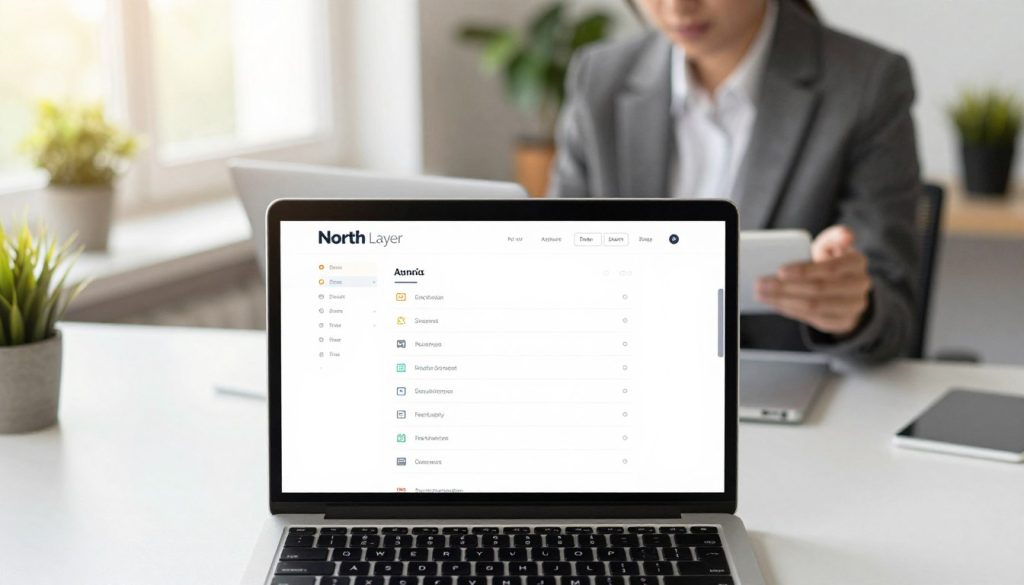
Use Descriptive Labels
Your menu items should clearly show their value. Avoid confusing labels that might puzzle first-time visitors. Use clear, descriptive language that tells users what to expect.
For instance, use “Services” or “Our Work” instead of vague terms like “Solutions” or “Insights.” This makes easy browsing and builds trust. When users find what they need quickly, they’re more likely to become loyal customers.
Remember, easy browsing is what makes a site professional. By improving your menu layout and keeping your intuitive menus consistent, you offer a smooth experience. This dedication to user-friendly navigation strengthens your brand and boosts your website navigation performance.
The Importance of Testing Your Navigation
Many business owners design menus based on their own knowledge. But, visitors don’t have the same understanding. Objective testing is key to making sure your website navigation meets your audience’s needs.
Testing your layout with real data removes the guesswork from your strategy. It helps you find issues that might scare off customers. By focusing on navigation design based on user behavior, you make your site more professional and reliable.
A/B Testing Options
A/B testing lets you compare two versions of a website element to see which works better. You might test different menu labels, like “Services” versus “What We Do.” You can also try different link orders or call-to-action button placements.
Even small changes can make a big difference in user engagement. By testing one thing at a time, you learn what your visitors like. This careful approach is key to creating seamless navigation on your site.
Gathering User Feedback
It’s also important to watch real people use your site. Ask someone new to your brand to do a task, like finding your contact page. Observe where they struggle or get stuck.
This feedback is very valuable for finding issues that numbers might not show. If users can’t find what they need quickly, your navigation design might need a change. Use these insights to improve your site’s structure and ensure a seamless navigation flow.
| Testing Method | Primary Goal | Best For |
|---|---|---|
| A/B Testing | Compare two variations | Optimizing labels and buttons |
| User Task Testing | Observe real behavior | Identifying confusion points |
| Heatmap Analysis | Track click patterns | Visualizing user interest |
Enhancing Navigation for Mobile Users
If your website is hard to use on a smartphone, you might be losing a lot of visitors. Over 52% of all web traffic comes from mobile devices. So, making your website navigation work well on small screens is key before you improve it for desktops.
A user-friendly navigation on mobile is essential for your business to grow. If visitors can’t tap a link or read your text easily, they’ll leave quickly.
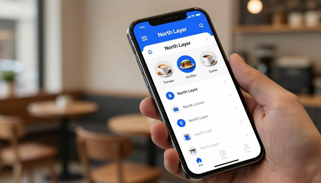
Prioritizing Mobile-First Design
Mobile-first design means designing for the smallest screen first and then making it bigger. This makes you focus on the most important content. It also keeps your menu layout simple and easy to use.
To make seamless navigation, make sure your buttons are big enough to tap with your thumb. Text should be easy to read without zooming in. And, your most important links should be visible right when the page loads.
Utilizing Hamburger Menus Effectively
The hamburger menu, with its three horizontal lines, is a common feature on mobile navigation design. It keeps your screen clean by hiding extra options until needed.
But, don’t hide your most important pages behind this icon. If users can’t find your contact page or product catalog, your user-friendly navigation has failed.
Use the hamburger menu for secondary links while keeping your main call-to-action buttons always visible. This balance helps users find their way to buy without feeling overwhelmed by a complex menu layout.
Examples of Effective Navigation in Successful Websites
Small businesses can beat the competition by copying the navigation of top websites. You don’t need a big budget for a site structure that guides visitors well. By looking at how leaders organize their sites, you can find patterns that make it easy for users to find what they need.
Notable Brands with Excellent Navigation
Companies like Patagonia and Apple stand out because they focus on simplicity. They use intuitive menus that match how customers think, not how the company is set up. This makes easy browsing the main experience for every visitor.
These brands also have big search bars and clear labels. When you visit their homepage, you know right away where to go. This makes it easy for users to stay focused on what they want to do.
Lessons Learned from Top Performers
The best sites put the user first in their website navigation. They keep secondary info hidden in footers or sub-menus. This keeps the main area clean and professional.
Here are key tips for improving your layout:
- Prioritize user intent: Organize links based on what customers usually ask.
- Use recognizable labels: Avoid confusing terms that might puzzle first-time visitors.
- Provide clear next steps: Every page should guide the user to a logical action, like buying or contacting.
Good site structure is all about understanding your customer. When you guess what they need, you create a smooth path that leads to sales. The table below shows how different navigation strategies affect the user experience.
| Strategy | User Benefit | Business Outcome |
|---|---|---|
| Clear Labels | Reduced confusion | Higher engagement |
| Prominent Search | Fast information access | Increased conversions |
| Logical Hierarchy | Easy browsing | Lower bounce rates |
| Mobile-First Menus | Seamless mobile access | Better retention |
Tools and Resources to Improve Navigation
Creating intuitive menus is easier with the right tools. You don’t have to guess how visitors use your site. With data insights, you can see where your site structure needs work.
Navigation Design Tools
It’s smart to plan before making changes. Use Figma or Lucidchart to make visual wireframes. These tools help you see how users will move through your site.
- Figma: Great for team design and prototyping.
- Lucidchart: Ideal for complex site layouts.
- Balsamiq: Simple for quick wireframe sketches.
“Good design is obvious. Great design is transparent.” — Joe Sparano
User Experience Research Tools
After your site is live, check if it works for users. Analytics show numbers, but session recordings show how users act. They help find issues like hard-to-find calls-to-action.
Integrate these tools to keep your site running well:
| Tool Category | Primary Benefit | Key Outcome |
|---|---|---|
| Session Recordings | Watch user behavior | Identify friction points |
| Google PageSpeed Insights | Check load times | Improve mobile performance |
| User Testing Platforms | Gather direct feedback | Validate intuitive menus |
These tools help you go beyond guesses. Regularly check your website navigation to keep your site easy to use. This focus on clarity boosts conversions and keeps customers happy.
Conclusion: Investing in Effective Navigation
Your digital storefront is key to connecting your brand with customers. Making your website easy to navigate is essential for growth. Businesses do well when they see their site structure as a dynamic asset.
The Long-Term Benefits for Small Businesses
Investing in user-friendly navigation boosts trust and sales. When visitors easily find what they need, they stay longer. This leads to a cycle of interest that helps your business grow.
Think of your site as a work in progress. Regular testing keeps your browsing experience smooth as your business grows. Analytics help you refine your site and remove obstacles.
Final Thoughts on Customer Retention
Smooth navigation on all devices keeps your audience happy. It stops frustration that might send visitors to competitors. By making each visit easy, you turn casual browsers into loyal customers.
Improving your site’s layout can make a big difference. Small changes can lead to big improvements in how people interact with your brand. Start optimizing now to keep your digital doors open for all visitors.