

Did you know a clear prompt can boost conversion rates by up to 161% for small businesses? Many owners lose potential revenue because visitors don’t know what to do next. Clarity is the bridge between passive browsing and a loyal customer.
A well-designed website call to action acts as a digital guide. It removes guesswork and reduces friction during the buyer journey. When you tell your audience exactly how to engage, you turn casual traffic into measurable business results.
We believe effective marketing should be simple and practical. By focusing on one primary website call to action per page, you help your visitors make confident decisions. This approach minimizes overwhelm and ensures your growth strategy remains focused on high-impact outcomes.
Key Takeaways
- Clear prompts can increase conversion rates by as much as 161%.
- Reducing user friction is essential for turning traffic into revenue.
- Focus on one primary objective per page to avoid confusing visitors.
- Direct language helps users understand the value of the next step.
- Practical design choices lead to better marketing ROI for small businesses.
Understanding the Importance of Calls-to-Action
A website without a clear path is like a store without a checkout. You might get lots of visitors, but they often leave without doing anything. By giving clear directions, you help people know what to do next.
What is a Call to Action?
A call to action, or CTA, is a prompt that encourages visitors to take a specific step. It’s like a bridge from reading to doing something. Whether it’s a button, a link, or text, it guides the user’s journey.
“The goal of a call to action is to make the next step so obvious that the user feels compelled to take it.”
Why CTAs Matter for Your Website
Your website is like a digital store, and effective CTAs are the sales clerks. Without them, visitors might not know what to do next. This can lead them to leave. Using CTA best practices keeps your site focused on your goals.
Clear CTAs make it easier for users. This builds trust and keeps them interested in your brand. Here’s how different elements affect user behavior:
| Element Type | Primary Goal | User Impact |
|---|---|---|
| Direct Button | Immediate Action | High Conversion |
| Text Link | Contextual Flow | Moderate Engagement |
| Form Field | Lead Capture | High Intent |
The Impact of Effective CTAs on Conversions
Studies show that clear prompts can increase website conversion rates by up to 161%. This big jump shows why you should always guide your users’ next steps.
By focusing on effective CTAs, you can turn casual interest into real results. Improving your CTAs boosts your website conversion rates. Following CTA best practices is key to growing your online business.
Key Elements of a Successful CTA
Every successful website call to action has key components that guide users toward a goal. When these elements work together, they create a clear path for visitors. Focusing on these basics helps small businesses save time and boost marketing results.
Clarity and Simplicity
The best buttons are clear and simple. Visitors should know exactly what happens when they click. Keep your language brief and avoid jargon that might confuse them.
A direct instruction is better than a clever phrase. By removing clutter, you let users focus on your value. Clarity is the foundation of every successful page.
Placement and Design Considerations
Where you place your button is crucial. Strategic placement ensures your offer is seen when users are most engaged. Place buttons where the eye naturally goes, like at the end of a paragraph or near a product.
Good design uses contrasting colors that stand out. This visual hierarchy guides the user’s attention. Consistency in your design builds trust and familiarity.
Compelling Messaging
Personalization boosts engagement. Research shows personalized CTAs convert 42% more visitors than generic ones. Tailoring your message makes interactions more relevant and urgent.
Effective CTAs address user pain points or desires. Use action-oriented verbs to inspire confidence. When your messaging resonates, your conversion rates will improve.
| Element | Best Practice | Goal |
|---|---|---|
| Clarity | Use direct verbs | Reduce friction |
| Design | High contrast colors | Increase visibility |
| Placement | Above the fold | Capture attention |
| Messaging | Personalized text | Boost conversions |
Types of Calls-to-Action
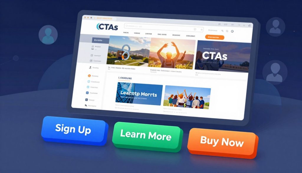
Choosing the right call-to-action is key to a smooth and effective website. It’s all about matching the action to what the visitor wants. This makes the site more intuitive and encourages people to take action. We guide you in picking the best call-to-action for each step.
Sign-Up Buttons
Sign-up buttons are crucial for lead generation. They’re perfect for getting email addresses for newsletters or creating accounts. Keep the text brief and focus on the immediate benefits, like “Join the Community” or “Get Weekly Tips.”
Download Links
Download links are great for offering valuable content like white papers or e-books. They provide an instant reward for sharing information. Make sure the button clearly states what the user will get to build trust.
Social Media Follow Prompts
Social media follow prompts are excellent for building a lasting community. They’re less pushy than sales-focused buttons. Place them in your footer or at the end of blog posts for maximum engagement.
Contact and Inquiry Forms
For visitors ready to work with you, direct contact or inquiry forms are vital. These should be simple and only ask for necessary information. Fewer fields mean more completed forms.
| CTA Type | Primary Goal | Best Placement |
|---|---|---|
| Sign-Up Button | Lead Capture | Sidebar or Header |
| Download Link | Value Exchange | Resource Pages |
| Social Follow | Community Growth | Footer or Blog End |
| Inquiry Form | Direct Sales | Contact Page |
Crafting Compelling CTA Text
Your button text is the last push for a visitor to act. The right words can turn interest into action. Follow CTA best practices for clear, professional, and effective messages.
Action-Oriented Language
The best buttons use strong, active verbs. Instead of “Submit,” say “Get My Guide” or “Start Your Free Trial.” This tells users what they’ll get.
Keep your message short and focused. A brief, direct phrase is easier to read and understand. Highlighting benefits helps visitors see the value of their next step.
Creating a Sense of Urgency
At times, visitors need a gentle nudge to act quickly. Use phrases like “Claim Your Spot Today” or “Offer Ends Soon” to create urgency.
But be real and avoid fake pressure. When using urgency, make sure it’s a real benefit for the user. This builds trust and drives conversions.
Personalization Techniques
Personalization makes interactions feel more human and relevant. Use first-person language, like “Start My Journey,” to connect better with users. It makes the benefit feel personal.
Customize your text for each user’s stage. Speaking directly to their needs increases the chance of a click. These CTA best practices make your experience more engaging for everyone.
Designing Eye-Catching CTAs
Great design turns a simple button into a powerful tool for growth. When visitors land on your page, their eyes should naturally gravitate toward your primary goals. Thoughtful CTA design ensures that your message stands out without feeling forced or overwhelming.
Color Psychology and CTA Buttons
Colors influence how users feel and act when they browse your site. Using high-contrast colors helps your buttons pop against the background, making them impossible to miss. Many successful platforms, such as Wix, use bold, contrasting colors and varied sizes to improve the user experience and guide visitors toward the next step.
You do not need a complex palette to be effective. Consistency is key when choosing colors for your call to action elements. Select a primary brand color that signals action and use it exclusively for your most important buttons.
Utilizing White Space Effectively
White space, or negative space, is the empty area around your design elements. It acts as a visual buffer that prevents your buttons from getting lost in busy layouts. By giving your CTAs room to breathe, you create a clean and professional look that builds trust with your audience.
Avoid the temptation to crowd your page with too many competing visuals. When you isolate a button with enough white space, you direct the user’s focus exactly where it needs to be. This simple technique often leads to higher engagement rates.
Responsive Design for Mobile Users
Most of your traffic likely comes from smartphones and tablets. If your buttons are too small or difficult to tap on a touchscreen, you will lose potential leads. Responsive design ensures that your call to action elements function perfectly regardless of the device size.
Ensure your buttons are large enough for a thumb to tap comfortably. Test your layout on various screen sizes to confirm that the design remains clear and accessible. A seamless mobile experience is essential for modern business success.
| Design Element | Best Practice | Primary Benefit |
|---|---|---|
| Color Contrast | Use bold, distinct hues | Increases visibility |
| White Space | Add padding around buttons | Reduces visual clutter |
| Button Size | Scale for touchscreens | Improves mobile usability |
| Placement | Keep in natural eye path | Boosts conversion rates |
Testing and Optimizing Your Calls-to-Action
Guesswork can hold you back online. To grow, you need a plan based on facts. CTA optimization is a never-ending process to find out what really gets your audience moving.

A/B Testing Your CTAs
A/B testing is key to improving CTA performance. It lets you see which version of a CTA works best for your visitors.
Try different things to see what gets the most action:
- Button Colors: Does a bright color grab more attention than a usual one?
- Copy Variations: Is “Get Started” better than “Join for Free”?
- Placement: Does putting the button at the top make more people click?
Analyzing User Behavior
Numbers tell a story, but pictures show the details. Heatmaps let us see where people click and where they might get lost.
“Data is the bridge between what you think your customers want and what they actually need.”
Click-through rates and session recordings give a full picture of what users want. If they’re skipping your main offer, it’s time to change your message or design.
Making Data-Driven Adjustments
After collecting enough data, it’s time to make changes. Start with small tweaks to see what really works.
This ongoing process makes your website better at turning visitors into leads. By focusing on real data, your site will keep improving.
Integrating CTAs into Your Content
Placing calls-to-action (CTAs) in the right spots turns readers into doers. A good CTA strategy makes sure your message hits the mark at the perfect time. It doesn’t feel like an interruption.
By fitting these prompts into your content smoothly, you make it easy for users to move forward.
CTAs Within Blog Posts
Don’t put buttons at the top of your blog posts too soon. Wait until you’ve shared a key benefit or solved a problem. This makes your prompt feel like a helpful suggestion, not a sales pitch.
Here are some good places for your links:
- Right after a compelling case study or success story.
- At the end of a section that tackles a common problem.
- In a summary box that outlines the article’s main points.
Strategically Placing CTAs on Landing Pages
Landing pages need a focused CTA placement strategy for high conversion rates. Put the most important action above the fold. But don’t stop there.
As users scroll down, offer more chances to engage. Keep your design clean and avoid too many options. A single, clear path makes users confident in their choice. Consistency in design across these spots strengthens your brand and builds trust.
Using CTAs in Email Marketing
Email is personal, so your CTAs should feel like a direct chat. A successful CTA strategy in email marketing is all about being brief and clear. Since readers scan emails fast, your main button should pop out right away.
Follow these tips for your email campaigns:
- Use action-oriented verbs that clearly state the outcome.
- Make sure the button is big enough for easy tapping on mobile.
- Stick to one main goal per email to avoid confusing the reader.
Avoiding Common CTA Mistakes
Even the best marketing plans can fail if visitors feel bombarded by choices. Small business owners often face low conversion rates because their sites lack focus. By improving your strategy, you can turn these issues into chances for growth.
Overloading Pages with CTAs
Too many buttons on one page can cause decision paralysis for visitors. A messy layout makes it hard for users to know what to do next. Effective CTAs need room to stand out, so the main goal is clear.
Instead of having many prompts on your landing page, focus on one main goal. If you need to add secondary actions, make them look different from your main button. This smart CTA placement helps guide users without distracting them.
Being Too Vague
Vague language can kill your conversion rates. Phrases like “Click Here” or “Submit” don’t tell users what they’ll get. Your CTA design should clearly show the value of the action.
Use verbs that tell users what they’ll get from clicking. For example, “Download Your Free Guide” is more appealing than a generic label. Clear messaging builds trust and encourages users to act confidently.
Ignoring Mobile Users
Many visitors use smartphones to access your site, but some businesses forget to optimize for mobile. A button that looks good on a desktop might be hard to tap on a phone. Ignoring mobile users can lead to high bounce rates and lost sales.
Make sure your buttons are big enough to tap with a thumb. Don’t put interactive elements too close together, as this causes accidental clicks and frustration. By focusing on mobile first, you make sure your site works for everyone, no matter the device.
The Role of CTAs in User Journey
Your website is like a digital guide, leading visitors from curiosity to commitment. By understanding their path, you can place the right prompts at the right time. This ensures your website conversion rates improve because you meet the user exactly where they are.
Mapping the User Experience
Every visitor has a specific goal in mind. Some are just browsing, while others are ready to buy. You must identify these stages to choose the best call to action elements for each page.
For example, a visitor on a blog post might need a gentle prompt, like signing up for a newsletter. On the other hand, a visitor on a product page needs a direct, high-intent button. By mapping these touchpoints, you can create a seamless flow that feels helpful, not pushy.

Funnel Strategies for Effective CTAs
We see the user journey as a ladder of engagement. You start by offering value, building the initial connection. As the user goes deeper into your site, your CTA strategy should shift from educational to transactional.
Begin with soft prompts that encourage exploration. As the user shows more interest, introduce stronger calls to action that invite them to take a concrete step. This gradual progression builds a relationship based on trust and mutual benefit.
CTAs in Retargeting Campaigns
Trust is key in purchasing decisions, as shown in the 2024 PwC Global Consumer Insights Pulse Survey. When a visitor leaves without converting, they’re not lost forever. Retargeting lets you re-engage them with a message that reinforces your value.
Use these campaigns to address specific hesitations or to highlight social proof. A well-timed, personalized CTA can remind the user why they were interested in the first place. By focusing on building trust, you turn a missed opportunity into a successful conversion.
Leveraging Analytics for CTA Improvement
You can’t improve what you don’t measure, and that’s true for your site’s calls-to-action. Guesswork can lead to missed opportunities and slow growth. By using data, you can turn your website into a powerful tool that converts visitors into leads.
CTA optimization needs both numbers and insight. Tracking the right data shows how people interact with your buttons and links. This insight helps you make changes that really work.
Understanding Key Metrics to Track
To improve your CTAs, focus on key metrics. These numbers show where visitors engage and where they lose interest.
- Click-Through Rate (CTR): This shows the percentage of visitors who click your button.
- Conversion Rate: This measures how many clicks lead to actions like sales or sign-ups.
- Bounce Rate: A high bounce rate near a CTA might mean the page or offer isn’t meeting expectations.
Feedback and User Surveys
Numbers tell you what’s happening, but feedback explains why. Sometimes, numbers show a problem but not the cause. Surveys can fill this gap.
Ask visitors about their experience. You might find out your button text is unclear or the placement is off-putting. This human-centric approach helps refine your strategy.
Adjusting Based on Performance Insights
After gathering data, it’s time to act. Use your analytics to test different elements like headlines and button colors. Small changes can lead to big improvements in improving CTA performance.
CTA optimization is an ongoing effort, not a one-time task. Regularly review your metrics and listen to your users. Stay patient, test often, and let data guide you.
Case Studies of Successful CTAs
Studying top brands can boost your conversion rates. By seeing what works, you can improve your own CTAs. These examples show that success often comes from being simple and clear.
Highlighting Effective Examples
Slack makes it easy for new users to join. They use the simple CTA “Try for free”. This approach is effective because it’s easy and offers immediate value.
By focusing on benefits, Slack guides users smoothly. This is a key example of CTA best practices. It shows you don’t need complex language to succeed.
Lessons Learned from Leading Brands
Top brands value clarity over complexity. They make sure visitors know what happens after clicking. This reduces friction and encourages action.
Visual hierarchy is also crucial. Successful companies make their main button stand out. This guides the visitor’s eye, which is key for improving CTA performance.
Key Takeaways for Your Business
You can use these lessons for your own site. Start by checking your buttons for clarity and ease. Use language that directly addresses your customers’ needs.
- Keep your messaging short and benefit-focused.
- Ensure your buttons have high contrast against the background.
- Test different versions to see what resonates most with your specific audience.
Your goal is to make the path forward easy. By using these strategies, you can create a better user experience. This can turn casual visitors into loyal customers.
Future Trends in Calls-to-Action
Digital marketing is always changing, and businesses need to keep up. Your CTA strategy must grow as technology changes how people interact with your brand online.
The Rise of Interactive CTAs
Old static buttons are being replaced by interactive elements. These new tools make users want to participate more. This often leads to more website conversions.
Personalization through AI
Artificial intelligence now helps tailor messages to each user’s needs. By using data, you can make your CTAs more effective. This means showing the right offer to the right person at the right time.
Integrating Voice Search and CTAs
Voice-activated devices are changing how we find and interact with information. Making your site work with voice commands keeps your business accessible to today’s consumers.
See these changes as chances to improve your online presence. Keep testing and be open to change to stay ahead in a busy market. Start small, track your progress, and watch your business grow through better engagement.